
First of all, you need to have jQuery installed on your template. jQuery is a powerful JavaScript library that allows you to do many cool things with simple coding and it is very easy to install onto your blog. We just have to simply include the scripts on our template. These scripts are conveniently hosted for us by Google.
Installing jQuery
The first step is to go to your Dashboard and click on Design > Edit HTML. You should see a page like the one below:

Now click on "Download Full Template" to backup your current template just to be safe.
Now search for the following line of code in your template:
</head>and place these lines of code before that one:
<script src='http://ajax.googleapis.com/ajax/libs/jquery/1.6.2/jquery.min.js' type='text/javascript'/>
<script src='http://ajax.googleapis.com/ajax/libs/jqueryui/1.8.14/jquery-ui.min.js' type='text/javascript'/>
<link href="http://ajax.googleapis.com/ajax/libs/jqueryui/1.8.14/themes/base/jquery-ui.css" rel="stylesheet" type="text/css"/>
<script type='text/javascript'>
$(document).ready(function() {
$("#BTtabber").tabs();
});
</script>
The first three lines installs the main jQuery library, the User Interface library, and the base CSS stylesheet onto your blog. The following lines is what activates the tabs, or turns them on.Modifying Your Template
The next step is to modify your template, placing the tabs within the sidebar. To do this first search for this line of code:
<div class='column-right-inner'>and paste this code right after it
<!-- TABBER -->
<div style='clear:both;'/>
<div class='sidebar-top-1'>
<b:section class='sidebar-top-1' id='sidebar-top-1' showaddelement='yes'>
</b:section>
</div>
<div id='BTtabber'>
<ul>
<li><a href='#widget-SB1' title='TITLE1'>LABEL1</a></li>
<li><a href='#widget-SB2' title='TITLE2'>LABEL2</a></li>
<li><a href='#widget-SB3' title='TITLE3'>LABEL3</a></li>
</ul>
<div id='widget-SB1'>
<b:section class='sidebar' id='sidebartab1' maxwidgets='1' showaddelement='yes'>
</b:section>
</div>
<div style='clear:both;'/>
<div id='widget-SB2'>
<b:section class='sidebar' id='sidebartab2' maxwidgets='1' showaddelement='yes'>
</b:section>
</div>
<div style='clear:both;'/>
<div id='widget-SB3'>
<b:section class='sidebar' id='sidebartab3' maxwidgets='1' showaddelement='yes'>
</b:section>
</div>
</div>
<div style='clear:both;'/>
<!-- END TABBER -->
Now you need to edit the code, changing the TITLE1, TITLE2, TITLE3 and the TAB1, TAB2, TAB3 to whatever you want to display on your blog.
The TITLE is what will be shown when your visitors hover their mouse cursor over the tab
and the LABEL is the actual text that will be shown on each tab.
Now click on "Save Template" and if you copied and pasted everything correctly you should get a message at the top of your screen saying "Your changes have been saved."
Adding Widgets
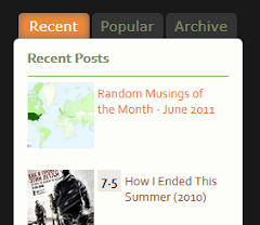
Now that the code has been added, you will want to add widgets to each tab. To do so, click on the "Page Elements" tab, and you will get a screen that looks like this:

Now take the time to drag and drop or add new widgets where you want them. When you are done hit "Save".
Changing the CSS
Now of course you will notice that the tabs may not exactly match your current template. Don't worry because they can be fully customized for your blog.
Go back to the Design > Edit HTML tab and backup your template again.
Now search for the following line of code in your template once more:
</head>and place this block of code before it:
<style type="text/css">
/* Tabbed Widget Style
----------------------------------------------- */
.ui-tabs{
       background: transparent;
       border: 0;
       padding: 0;
       margin-top: 20px;
       margin-bottom: 20px;
       width: 350px;
}
.ui-tabs .ui-tabs-nav{
       text-align:center;
       left: 10px;
       position: relative;
       border: 0;
       background: transparent;
}
.ui-tabs .ui-tabs-nav li {
       background: none;
       border: 0;
       top: 0px;
       margin: 0 3px 0 0 !important;
       padding-bottom: 0 !important;
}
.ui-tabs .ui-tabs-nav li a{
       -moz-border-radius-topleft: 5px;
       -moz-border-radius-topright: 5px;
       -webkit-border-top-left-radius: 5px;
       -webkit-border-top-right-radius: 5px;
       border-top-left-radius: 5px;
       border-top-right-radius: 5px;
       padding: 4px 6px;
       color: #80906A;
       background-color: #333333;
}
.ui-tabs .ui-tabs-nav li.ui-tabs-selected a{
       color: #FFFFFF;
       background-color: #CCCCCC;
}
.ui-tabs .ui-tabs-nav li a:hover{
       text-decoration:none;
       color: #FFFFFF;
       background-color: #CCCCCC;
}
.ui-tabs .ui-tabs-panel{
       padding: 0 0 !important;
}
/* End Tabbed Widget Style
----------------------------------------------- */
</style>
I will walk you through each section of the CSS code to determine the changes you need in order to match the tabs to your template.Section 1: .ui-tabs
.ui-tabs{
       background: transparent;
       border: 0;
       padding: 0;
       margin-top: 20px;
       margin-bottom: 20px;
       width: 350px;
}
This first section affects the entire tabbed widget container.The setting you will most likely want to change is the width. Typically to get it to match the rest of your sidebar widgets you will want to set this to be 10px less than your sidebar width. But you may have to go up or down depending on your template.
You might also want to adjust the margin-top and margin-bottom settings, these control the amount of space between your jQuery tabbed widget and the widgets above and below it.
Hint: go to Design > Template Designer > Adjust widths, to look up your current sidebar width setting.
Section 2: .ui-tabs .ui-tabs-nav
.ui-tabs .ui-tabs-nav{
       left: 10px;
       position: relative;
       border: 0;
       background: transparent;
}
This code affects the container that the clickable tab buttons reside in. Think of it as a box holding your buttons. Most of us will want this box to be invisible, and indeed this is what my default settings do, but you can set the background color or add a border if you wish. One setting you may want to adjust is the left attribute, my default setting puts the buttons flush with the left side of the widget, adding to the value will shift the buttons to the right, while subtracting from the value will shift the buttons to the left.
Section 3: .ui-tabs .ui-tabs-nav li
.ui-tabs .ui-tabs-nav li {
       background: none;
       border: 0;
       top: 0px;
       margin: 0 3px 0 0 !important;
       padding-bottom: 0 !important;
}
This code affects the positioning of the buttons themselves. The background, border, and top settings should be left alone here.The margin setting determines the gap of space in between the buttons themselves. The default setting is 3px you can increase or decrease this if you wish.
The padding-bottom attribute determines the distance between your buttons and the widget content below. The default is no gap, but you can enter any value you like.
Section 4: .ui-tabs .ui-tabs-nav li a
.ui-tabs .ui-tabs-nav li a{
       -moz-border-radius-topleft: 5px;
       -moz-border-radius-topright: 5px;
       -webkit-border-top-left-radius: 5px;
       -webkit-border-top-right-radius: 5px;
       border-top-left-radius: 5px;
       border-top-right-radius: 5px;
       padding: 4px 6px;
       color: #80906A;
       background-color: #333333;
}
This code affects the text, colors, and sizing of your tab buttons as well as the rounded corners of your tabs.Because each of the major browsers acts differently, there are 3 sets of settings for the rounded corners. My default settings are a radius of 5px but you can change them to anything you want. 0 represents a square corner.
The padding setting controls the amount of space surrounding the text label, and therefore the size of your tab buttons. The default is 4px above and below, and 6px on each side. You can fine-tune these values if you wish.
The color setting controls the color of the text, while the background-color controls the color of your tab button.
Section 5: .ui-tabs .ui-tabs-nav li.ui-tabs-selected a
.ui-tabs .ui-tabs-nav li.ui-tabs-selected a{
       color: #FFFFFF;
       background-color: #CCCCCC;
}
This section affects the text and colors of the currently selected tab.The color setting controls the color of the text, while the background-color controls the color of your tab button.
Section 6: .ui-tabs .ui-tabs-nav li a:hover
.ui-tabs .ui-tabs-nav li a:hover{
       color: #FFFFFF;
       background-color: #CCCCCC;
}
This section affects the text and colors of tabs when the mouse cursor is placed over them. I have my values set the same as the ones for the selected tab, but you can set them to anything you want.Section 7: .ui-tabs .ui-tabs-panel
.ui-tabs .ui-tabs-panel{
       padding: 0 0 !important;
}
This last section controls the container of your widgets. The box that holds the actual widgets. Normally you will want to leave this setting alone.That's It!
If you have any questions or problems setting this up, leave a comment below and I will help you figure it out.
No comments:
Post a Comment